Design might not be the first thing you think about when planning your virtual summit, but it could be the difference between thousands of registrations and disappointing turnout. After six years without covering this topic on the podcast, I knew it was time to bring in an expert who could share fresh perspectives on how visual design impacts summit success.
Today's conversation dives deep into the design mistakes that are costing summit hosts registrations and sales, plus practical strategies you can implement even if you're not a designer. My guest Tracey shares her streamlined approach to creating professional visuals that attract dream speakers, boost registrations, and build the trust your audience needs to sign up for your summit, and invest in your all-access pass!
Listen to the episode
Prefer to listen to this post instead? Use the links below to listen on your preferred podcast player:
Download the episode transcript here.
Episode at a glance:
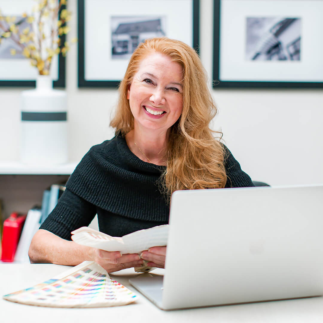
[1:32] Tracey Albrecht, founder of Soapbox Studio, has been passionate about design since childhood and has been helping businesses create professional visual identities for over 27 years. Her agency has evolved from serving Chicago's local businesses to offering membership-based design services specifically for digital entrepreneurs who need to elevate their amateur-looking branding.
"I love seeing business owners take their homemade or DIY brand and level it up to look like the professionals they are. Most of the women that I have worked with in the past several years are super smart, super professional. They know what they're doing, they know their audience, but yet they look like they don't. That one shift in their brand could just elevate them to the next level."
[6:58] The most common design mistakes Tracey sees in virtual summits include unprofessional or disjointed logos, low-resolution images, poor visual balance on registration pages, and graphics that don't align with the host's brand or speak to their specific audience. Many hosts use templates without customizing colors or imagery to match their business, creating a disconnect between their summit and their established brand. That doesn't have to be you!
"A lot of hosts will have a professional logo for their company, but then they'll create their own summit logo, and it just looks disjointed, or it's in a different color scheme. Your summit logo should lend itself to your business so it doesn't look like a completely different thing."
[10:30] Poor design directly impacts your bottom line by costing you registrations and sales. Tracey shares a personal example of refusing to register for a summit because the graphics looked so unprofessional that she questioned whether it would be worth her valuable time. When your visual presentation doesn't match the quality of your expertise, potential attendees make quick judgments about whether to trust you with their time and money.
"The bottom line is, it is costing registration clicks. It's costing you people not registering. My time, your time, like, everybody's time, is super valuable. And you have so many different opportunities to learn and better yourself, and summits are a great way to do that. But you don't want to waste your time on something that looks like it might not be a fit for you."
[13:08] For those who can't afford to hire a designer yet, Tracey's top advice is to keep everything simple. Use the same fonts and color scheme from your existing business branding, add only one additional color if needed, avoid complex icons, and maintain visual consistency across all summit graphics. Simple design choices prevent you from making costly visual mistakes while still looking professional.
"If you are doing it yourself, and design or creativeness is not one of your strong suits, just keep it very simple. Use the fonts that you're using in your business branding. Use the same color scheme, maybe with one other additional color that could really make it pop."
[15:47] What makes design look polished versus amateur comes down to avoiding visual clutter and maintaining proper spacing. Non-polished design typically includes too many elements trying to represent every aspect of your business, multiple conflicting fonts, and text that extends all the way to the edges without breathing room. Professional design uses consistent fonts with varied weights, strategic photo overlays, and adequate white space to help busy audiences quickly understand your message.
"Non-polished is very busy. People just don't like that when they look at it. The attention span of everyone is so short, and it's getting shorter as time goes on, so you need to make sure that your pages are readable, that the message is clear."
[18:51] Need a professional logo for your next summit? Tracey's streamlined logo design process eliminates the traditional lengthy consultation meetings by using a comprehensive online form that captures all necessary information about your business, colors, fonts, target audience, and design preferences. This approach allows them to create professional logos at a fraction of typical design agency costs while maintaining the expertise that comes from decades of experience.
"We have done a lot of summit logos, and they are so much fun. I'm sure some people listening probably had a logo done by us, and we have the process so streamlined now so we're able to offer affordable packages with two options that are geared specifically to online business owners."
About Tracey Albrecht
 Tracey Albrecht started Soapbox Studio in 1997 to offer high-quality graphic design services to Chicago-area businesses in a physical studio. However, over the past several years, Tracey has expanded the business to online services, specifically online business owners.
Tracey's Website | Get the real Logo RX guide
Need a professional logo?
Resources

View related episodes >>
Pin it for later!